Showing posts with label Research and Planning. Show all posts

Monday, 29 November 2010

Photos for Ancillary

Today jack and I used the lesson to take photo's for the background of the advertisement. We decided to split off as we both had free's after the lesson, Jack went to take photos of fields and rural landscape, so I went and took photo's of the graveyard.

Here are the photo's which we can hopefully experiment with to create an effective print that ties in with the digipak. It has been snowing so that will create contrast, however miss somell thought it would look picturesque and I don't feel it would hurt to try it out.


before going our seperate ways we bumped into Jordan, he had a scooter and a cigerette which we felt was very ironic and quite rebellious whilst at the same time creating humour, we decided to take a photo, although it is entirely spontaneous and he isnt in any costume etc. I think it works quite well (as a test shot) although if we were to use it we would have to dress it up more. 


I took a variety of photos which i feel will work well on the advertisement. some of them are purely to be used as a background giving it texture and others are to compliment the scenery used in the video. 

Sunday, 28 November 2010

Looking at Print

I was looking on the internet at different prints for bands, some of the prints i looked at i chose because i was interested in the text used and how it was displayed. 


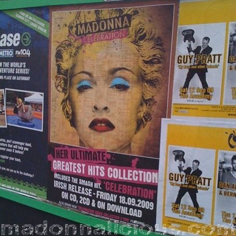
On this Madonna Ad they have made the cd cover the feature in the centre/top part of the print. They have then used contrasting colours to display the information underneath. This works well as it does not draw attention away from the cover. It also allows the audience to see a picture of the cover so that if they want to go out and buy it, they are familiar with it. 


I love the simplicity of the mumford and sons ad! it uses the artist and album name as the main text on the album, displaying other relevant information in a smaller type face. Some of the other information includes songs that are featured, release date etc. I think a minimal look is definitely more striking, and looks professional. This all contributes to the reputation of the band so the image is really important. The photos are of each band member, however as jordan is a solo artist we do not need to worry about this.


I love the back of the mumford and sons album cover! it reminds me slightly of the one i created. I think the minimal look works best as it allows the consumer to find the track with ease. I like the way the song names are displayed although i think it is easier to navigate as a list.


this Florence and the machine ad creates a glamourous image for the band, however i do not think it is in keeping with the other band prints. I like the use of fonts, and although i do not read the language it is written in, the imformation is minimal and uses techniques to try and sell the album, e.g. "hit album" "brit awards 2010". Florence's album cover also features a similar layout to the one i have used, featuring the artist at the top, and album name below. I think this works well as it is neat, and simple to follow.


Light speed Champion's album also features the typography layout I am using for my Cover, it is very conventional, but looks neat and polished. the simplicity of this layout looks very professional, which is why i think it is a safe style to use.

Tuesday, 23 November 2010

Brandon Flowers Advert analysis


The advert is designed to give an early preview and exposure to a newly released album, and therefore they often use the artwork of the new album in abundance. An example of this would be Brandon Flowers' ‘Flamingo’ Album.
As you can see here,


The album artwork is included on top of a photo of Brandon flowers' himself. I think that this allows fans of Brandon Flowers to recognise him from his other band ‘The Killers’, which will be used as a selling point for his new album.  
Fonts that are used on the advert are identical to the fonts of the cover art, which allows that font to become iconic to the band, so that when that font is spotted, recognition of the band/artist can easily be gained.


Other unique conventions and aspects to magazine adverts, which I will need to focus on, are:

  • ·      Feature artists website, fan page, social feed… any form of web 2.0
  • ·      Different versions of the album, for example the ‘Flamingo’ has a deluxe edition…
  • ·      The price can be featured, but often isn’t
  • ·      Release date of the album is crucial, and is almost always on an album ad.
  • ·      Information on future releases, such as to-be-released singles off the album
  • ·      A small preview of the album cover itself, like I highlighted above.
  • ·      Artists name as a header to highlight importance. Notice how in the flamingo poster above, ‘Brandon Flowers’ is top and central.
  • ·      Imperative is often used ‘Buy It Now!’
  • ·      Heavy usage of the Artist’s name
  •  The theme for the Brandon Flowers album is obvious, and consistent. The same images, and same type of images are used over and over again, which enables familiarity.


I will use all these conventions as a check list when it comes to designing our magazine poster for Hewitson River. 

Although I'm not producing the digi-pak, I found this when I was researching pictures of Brandon Flowers' marketing, and I thought it might be useful...


Other CD Conventions

I am interested in looking at the more linguistic side of our ancillary task. Rather than just looking at examples of other band/artist's CD covers, I thought it was important to look at the dedication & thank you pages and promotional information within other bands CDs.

 This is from the Maccabees album 'Colour It In'. For one, the design on the album relates to the title as it has the iconic image of the cartoon people, coloured in a child-like way, and this is carried on through the rest of the album, creating an individual image. This page is used for copyright purposes, with information about the producers and designers, credits to people involved, and also includes promotional information such as the band's myspace and website. At this moment, I am not sure what information we will need to include on our album cover, as nothing is actually copyrighted. But in terms of promotional information, I am really keen on making a small insert, as seen in this blog post.

 The Maccabees used a page to include a dedication in the album, as seen above. I think this is a nice idea but I don't think it would work within our CD because of the image we are trying to portray of Hewitson River, as we are playing upon the idea of him being self-obsorbed & miserable (much like Morrissey!)

This is a single from McFLY, who used a panel to promote an upcoming album. I think that if we were going to include an insert in our CD, then it should either include contact information such as twitter, facebook, myspace & a website, or details of a tour. I personally think that a panel in our digipack, or section of a panel, could be dedicated to Hewitson's social networks, and an insert could promote a tour, because this is a more common and conventional way of advertising.

In an earlier album, McFLY use polariod photos in their section of the album for 'thanks'. This part of a CD is a very common and quite an important part and something we should probably include. We could take inspiration from the polaraids used, as it relates to our 'old' theme and we could easily create polaroids on photoshop. It has a simple but effective look.


Jason Mraz's thanks is very lengthy and I don't think we should aim for something as long as this, but I like how the text is arranged around an image. We could use this for inspiration for both our back cover and our 'thank you' page.

Digipack Analysis


I don't know the band who owns this digipack as I found it on google images but I really like the style of it. They have used an earthy kind of colour pallette to match their design of the tree, flowers and leaves and I really like how the bottom three panels link into each other. I love the roots branching out to the track list as it is unique and out of the ordinary. I think we could be more imaginative with how our track list is set out so maybe this is something we could experiment with, using the design to present the track list.
From what I can see, the top left panel and the panel next to it are used for the copyright information and credits. I like the font used as it is looks like handwriting, and so fits the natural theme of the digipack, and the consistancy of the design throughout works really well and gives the pack its own feel. 
The thing that I don't like about the digipack is the album name 'And They Will Riot!' as I don't think it matches the rest of the digipack, as it has quite a violent feel about it, which completely contrasts with the naturistic design. The font is also quite a lot harsher than the quirky handwriting type font on the rest of the pack. I think that consistancy is really important within the CD cover and the advertisement and definitely something that we need to keep in mind in terms of our image, colours and fonts.

Monday, 22 November 2010

Planning This Week's final filming


Currently we are working to schedule, we hopefully will have everything done by thursday/friday if everything goes to plan.

Wednesday, 17 November 2010

Tomorrow's Agenda - Rotoscoping

As I have the day off school tomorrow, I am intending to film all of the footage that I need in order to rotoscope. I am trying to fill in the space in the video where it explains how it is night in one scene but day in another, hopefully this will do the job.


Above is some rough concept art of one shot that I was thinking of doing, as the sun and moon move across the sky to signify to the audience that the time of day is changing. Showing Jordan walking also shows that he actually went to the graveyard rather then just appeared there. I'm fairly sure that the finished sequnce will look fairly different to this when I come to actually drawing it out and seeing what works and what doesn't; bear in mind though, that this is only a picture to get the feel of the sequence. The final shot will reflect what has already been produced as well, in terms of art style at least.

further DigiPack research

My boyfriends dad works for universal music so is able to get hold of CD's packaged in a digipack, he has arranged to get some for me to analyse in order to work out which layout will work best, this will also help me to analyse which style will be easiest to produce. I think this will compliment the video Jacks uploaded, and will also make it easier to visualise the end product. I will look out for any key concepts placed on the pack such as logo's, production info etc. I will then pass the information on to Sofie as she is arranging what text I need to add.

Digipak options

Today Sofie was telling me about different digipak ideas she had, so I found this video for her, which I think could be helpful...

Shooting problems

Today I was going to use the media lesson to go and take more photos of Jordan to use for different advertising forms, such as a poster. However I didn't anticipate how bad the weather conditions would be.

It's raining a lot, and the lighting is not what I wanted, therefore I'm going to either take photo's indoors, or take them when the weather is better condition. It looks like it should clear up by friday, so I might have to do everything then, which would not be a problem as I will be able to take the photos near the location. 

Tuesday, 16 November 2010

Experimenting with different designs

Here are a few designs I am currently experimenting with, however I won’t make any decision without consulting the group first. I think it’s important to hear the feedback from everyone before any decisions are made.
I like this design because it incorporates the field scene which features in out music video. However I think it could be perhaps too simple. I like the use of vignette because it enables consistency throughout our whole project.
 
 I like the photo of this design, along with the shadows and saturation, however I am not sure I like the font I used. I like the warped text look, because I think it is more visually interesting to read, especially when it’s only a short word or two.

This design is perhaps one of my favourite. It kind of reminds me of the iconic retroscoping from our music video, therefore can relate to fan base. I like the use of colours in this design, and how they are juxtaposed with the saturation of the background. 


 I also experimented putting the ‘Hewitson river’ Logo at the top and bottom of the page to see where I preferred it. I think I liked it better at the bottom because it connotes that the artist is so big, he doesn’t need to be announced. This contributes well to the persona we want out protagonist to be in out music video… arrogant.


Development of different elements within an advertisement.

When designing and researching marketing campaigns, I researched other forms of advertisement, which can be seen in my previous blog posts, and other bands types of advertisement. 


I think it's crucial to look at fonts, colours and setting when preparing an advertisement, because this is what is going to portray the artist to the fans. Therefore I think that when developing out digi-pak, all fonts and colours should be constant. 
I decided to look at effects such as vignetting, used in the above picture. I decided to look at this because in my opinion it looks visually pleasing, and also relates to our music video, as we used vignetting in our music video a lot. 


Green screening

Tomorrow I will be filming Jordan against a green screen in order to get the close up shots I want for the gave scenes. Because I will use industrial lighting, the green screen should not be too noticeable. 
I like this idea, because we can later use the unused footage as stock footage for other scenes, and just add a different backdrop accordingly. 

Mocking up ideas


I am currently mocking up some advertisement ideas, I have designed a few already, which will be uploaded in short time.

Plan for feedback


We aim to get most of our video completed by Friday, in order to hand it in for some further feedback. I think we need feedback on the shots we recently took, because I want to know how the audience will perceive the story line.
I plan on sending out a draft version to a few people over twitter, as I have over 500 followers, it would make as a great audience feedback source. 

Experimenting with the cd front cover and back


here i have taken a still from the video and made it black and white. I then altered the grain of the photo which made it look very vintage (almost victorian!), i felt this looked a bit too old so played around with different effects, i then chose to add a slight poster filter to the grain making it slightly smoother and fairly stamp like. Firstly i experimented by using it as the front cover, I quite like this however i think i prefer the close up of Jordan's face more.


I then experimented by turning it into the back cover and using a handwriting style font (never let go). I think this works really well and compliments our genre, although i would need to make it tie in with the front cover as there is too much difference between the two, however this should not be too bigger problem. I think the font style may look better in a more similar font to the cover, using capitals to tie it together. these are some of the things i will take into consideration when developing my ideas.

CD Cover Research


When in Leicester recently, I saw a band called Arabella busking and handing out free copies of their EP. Arabella are a small band but quite well-known in the midlands area (Leicester, Coventry, Birmingham). As they would have had a low budget on making their EP and most likely did a lot of it themselves, I thought it would be interesting and useful to see what they included in their CD slip. 
The design is very basic but effective, however not the approach we wanted to take with our CD cover as we are set on the idea of using Jordan as our front cover to relate to our video. The front of the CD slip included the 'album' name and the band name which are two things we have included in our draft sketches. Something they have not included that I think would be beneficial to include on our own, is the name of the single they are mainly promoting, in our case 'Big Mouth Strikes Again'.


The back of the CD slip had the track list and the band's website and copyright details. As we are creating a website to promote Hewitson River, this is something we will also include on the back part of our CD cover. The simple style fits well with the front of their CD slip, however such a simple and pain design would not fit with our CD cover. I think something a little plainer than our cover, but with the same colour pallette and prehaps the cover image on a smaller scale, or a similar image, would work best.

Inside of their CD slip, they included small inserts with tour and contact details. I have not seen this used with many bands and think prehaps it could be an interesting thing to include in our work as something a little extra, as it is a great way of promotion and advertising and to get Hewitson's facebook/twitter pages out there!

Illustrated Album Covers

An illustrated cover would compliment the rotoscoping we have included in the video, I think that illustrated covers look very iconic and are a good way of branding an artist, however it may not be for a new artist and a photograph may work better to put them into the limelight and get their name put out there.


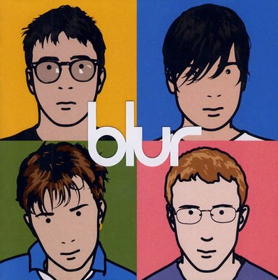
this is perhaps the most iconic blur cover of all time created by Julian Opie, I like the popart style incorporated onto the cover however this would be too modern for our Digipak. The cover is fairly unconventional by only mentioning the artist's name and missing information such as album name etc. I think this works well as the band at this time were already very popular, this image however would not be as successful for Hewitson River as he is a new band releasing his first album, so I think that by creating something using photography would work more effectively.


Another Iconic album cover, this time for the indie genre, The Maccabee's colour it in (as previously mentioned). It is very eye catching and memorable, I personally think the illustrations are very attractive and would entice the consumer if they are unfamiliar with the songs. This is the maccabee's first album and although i said i think a photo would work better, i do think this works really well! so it may be interesting to create some illustrations and create a different colour, just incase ours works this well! The incorporated the illustrative design throughout the images and the typography, using very handwritten style font's, so this may be something to try.


I really like this cover because the simple use of line and shading makes it interesting, and the image substituted in position of the mouth add's a quirky touch, similar to the quirkiness we have in our video. I dont think this particular style would work as well as the less fine illustrations as it doesnt make a bold enough statement. I like the fonts used and think it works well as they compliment each other side by side.