Sunday, 7 November 2010

Looking at Rankin for photography ideas

Rankin's Portfolio

Rankin is a renowned photographer, and has an astonishing portfolio with creative and powerful pieces of work. I think that by looking at such a powerful photographer, it will allow us to gain some inspiration when shooting Jordan for the print/digipack.


The rule of thirds


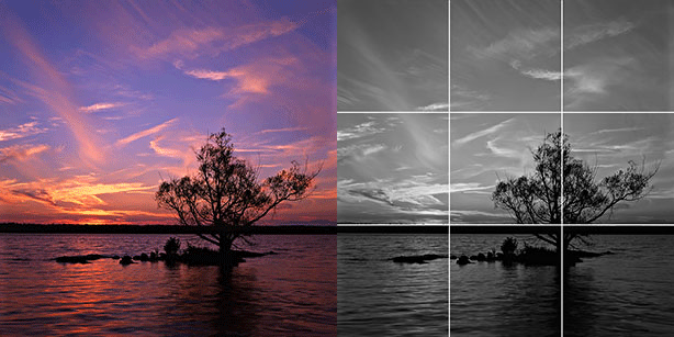
The rule of thirds is a compositional rule of thumb in visual arts such as painting, photography and design. The rule states that an image should be imagined as divided into nine equal parts by two equally-spaced horizontal lines and two equally-spaced vertical lines, and that important compositional elements should be placed along these lines or their intersections. Proponents of the technique claim that aligning a subject with these points creates more tension, energy and interest in the composition than simply centering the subject would.
The photograph to the right demonstrates the application of the rule of thirds. The horizon sits at the horizontal line dividing the lower third of the photo from the upper two-thirds. The tree sits at the intersection of two lines, sometimes called a power point or a crash point. Points of interest in the photo don't have to actually touch one of these lines to take advantage of the rule of thirds. For example, the brightest part of the sky near the horizon where the sun recently set does not fall directly on one of the lines, but does fall near the intersection of two of the lines, close enough to take advantage of the rule.


(research from wikipedia)

In art and design, I find that grids also help with accuracy if following a plan, so this maybe another thing to consider when creating the prints. I plan on creating test prints using the rule of thirds to see if it energises the photo, I will do this when we come to shooting the final photographs for the print.

experimenting with print


here i created a vintage filter by duplicating the photo's layer and changing the foreground and background colour to green and red. i then blended them together with the original photo to create the vintage look. I added noise and a vignette similar to the previous prints i made.


Here i used the same print however i used the magnetic lasso tool to cut around jordan, i added a 3 pixel feather and then used select inverse to select the background, i then edited it making it black and white. i like this as it brings the eye to jordan, as all of the colour is on him. It also compliments our video as jordan is ironically bright and happy in a dull and negative graveyard.


Here i rearranged the text and added the song title, i was experimenting with typography and positioning. I like the fonts used for "hewitson river" (rough typewriter and Octin vintage, which i downloaded online) they make connotations to the vintage theme of the video whilst making a statement with the boldness of the letters.


Once again i experimented with the positioning of the lettering, I think that the first test I did (at the top) works best, as "hewitson" covers the width of the poster and "river" being a taller and thinner font, fits well underneath.


Here i have experimented with borders for the poster, similar to the polaroids i used in my previous experimentations with posters. I think this adds a finishing touch to the poster as it makes it look more polished. I used a letter and brown paper brushes to create the background, this connotes to the vintage style, and is quirky as it is fairly random, I like this as it should attract to our target audience with its artistic look.


Here i have made the sides of the original poster more rugged to create a more vintage effect. I was experimenting with brushes so tried out the vintage chandelier, I think it needs something more on the central poster, although I am undecided on whether or not this is the best thing for it so would need to experiment further.

Friday, 5 November 2010

First draft thoughts

At the start of the day I was a little worried because I hadn't seen everything we had, put together. Towards the end of the day, when everything started to come together I felt more confident.
Because of the problems we had with sharing large files over the internet, we were faced with a tight schedule to get mostly everything in a state where we had something to hand in.
We put all our clips we edited together on Owain's laptop, and tweaked a few things, such as satuaration, contrast and added filters.
I think our overall draft reflects somewhat what we're aiming for our final music video, however I feel that there is a lot of work yet to be done.

First draft

Today we finished editing the first draft, we put together as much as we could but still have more to film. We sent owain the parts we edited separately which he then put together yesterday as he had a free day, then today we went over everything and changed parts of it slightly, adding in clips from jacks MacBook which were unable to be uploaded to mediafire.

Filming

It was raining today so we are having to improvise. We are going to jacks in the media lesson to use a greenscreen as we can use the background from previous shots.

Thursday, 4 November 2010

Filming

as filming didn't go to plan yesterday as we did not have our actor, I think it may be an idea to use the shots jack and i did when looking at location. click here these are of a HD quality and also fit in with the theme and story we have imagined from the start. this will purely be for the first draft so that our peers can see where the video is going so they can feedback. From there we can then decide whether to use or re-film similar shots. I will be meeting with Jack tonight to edit these shots and then we will get them to owain.