I like the contrasting black and cream, and the stamp effect of the picture. I think creating a poster like this would look too old, and we want to achieve something modern but with a vintage style. I like the text and think it works well.
I like the photograph used, however i think the poster is rather boring and would rather create something more visually interesting for the poster.
I really like this as it's fairly busy and the yellow colour makes it interesting, however i dont think this style would be appropriate as use of photography would appeal more to the audience so that they can see some star persona.
Here are some more modern print's that I like...
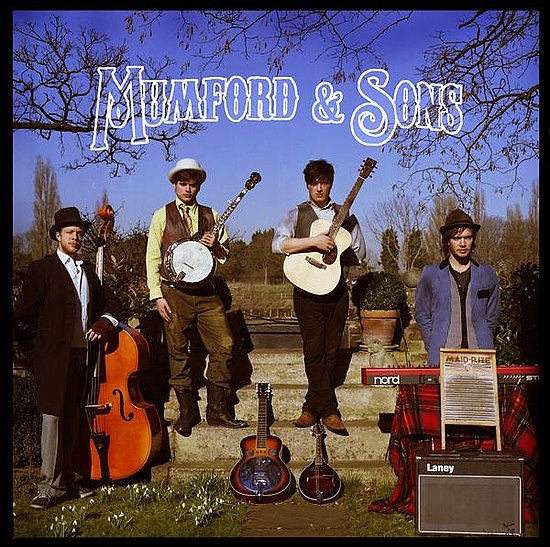
I love this as it incorporated the vintage style but the high quality photograph/editing and font look modern.
I like the ransom letter style they have gone for with the font as it looks artistic! I think this overall is too 'punk' due to the high contrast of the photograph and the style of the boys.
I like the use of black and white photography and the simplicity of the bands branding in the bottom left hand corner.
I really like the tea stain effect and think it is something that we should consider when creating the poster as it gives an old style effect.
I like the use of typography here as it looks retro. Again the black and white photo looks effective and professional, creating the vintage style we are looking to achieve.
I have found that even from briefly researching bands merchandising, it has been very inspiring and has given me lots of ideas to take back to the group and talk about!


My favourite one is the clash one!!
ReplyDeleteGood work, sugar plum
Yeah :) i like that! i don't like the stamp effect on photo's though, it reminds me of sony erricsons lol! like the font and colour scheme though! we should experiment xx
ReplyDelete