I like the simplicity of this album, how the simple white text draws the eye to the band's name and album info, yet the vintage style pattern in the background gives it a quirky and interesting feature, making it more than just text, i think this font style is too modern for our prints, and we would need to look at more vintage style fonts to follow through with the vintage theme.
I really like the simplicity of the album here, The band were actually painted on by an artist for this shoot! a tad too extreme for our video, but we could create something vibrant and similar if we wanted too, however the bright colours do not connote to the vintage indie theme we are trying to achieve. I really like the white background as it brings attention to the band in the foreground, allowing them to be the main focus which i feel is important. If we decide on using a band/artist based print, i think one on a white background would work really well.
this is an advertisement for a gig, although it is not album based i think it is quite inspiring with the typography used and the unusual photography, however if we were to create something like this we would need to use the relevant information of a band promo, e.g. record label, album, dates, availability (e.g. itunes).
This album cover has become iconic to the maccabees, I love the use of illustration and think that iconic images create a really good image for a band as people will be able to recognise them purely on the illustration alone. The colour scheme is too bright and contrasting for the look of Hewitson River and would not add continuity throughout the video and the digi pack.
I love this album cover for tokyo police club, the busy background makes it interesting and eyecatching, the simple use of the diamond with the plain black text inside gives it a polished professional finish which works really effectively.
Again this is the promo for a gig, but i like the use of graphics and font, the colours are too vibrant for what we are looking, but i think the artistic look of the ad would attract our target audience.
This is the promo for an indie boyband in Leicester, I like the manipulation used on the photo as it captures the audiences attention with the contrasting red and blue. Another effective part of the print is the use of font, as it is used throughout making it look professional and polished. The iconic logo's for the various companies the music is available at makes it also look professional.
I like the use of illustration used here, although it is simple it is eye catching, with a basic colour scheme and the bands 'bombay bicycle club' stitched style logo which is iconic to the band creating a brand for them.
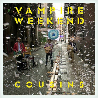
I like the use of colour used here as it makes connotations to the indie genre, i do not think the yellow font works well and something like this would not be appropriate for our video as it is too vibrant, a more subtle bright colour may be effective, i will test out colour palettes and experiment with possible colour's by taking inspiration from the video. I dont think the unclear picture works well, as the paper fluttering down distorts the view of the band, however it relates to the video as it is one of the stills.
I do not like the arctic monkeys logo, i think it looks rather tacky and doesn't portray an indie genre like we are aiming for. I really like the photo used, it is simple yet makes connotations to a bad attitude as the artist is smoking. We could create something similar to this however make it our own by bringing in Hewitson's style.


-2010-front.jpg)

No comments:
Post a Comment