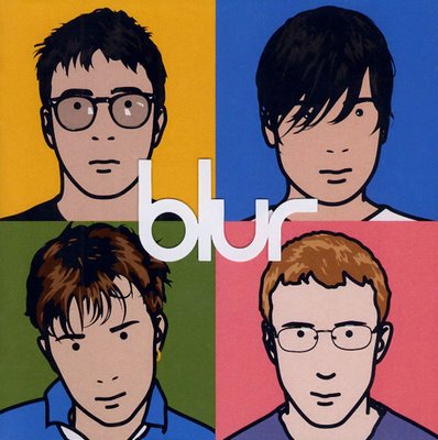
An illustrated cover would compliment the rotoscoping we have included in the video, I think that illustrated covers look very iconic and are a good way of branding an artist, however it may not be for a new artist and a photograph may work better to put them into the limelight and get their name put out there.
this is perhaps the most iconic blur cover of all time created by Julian Opie, I like the popart style incorporated onto the cover however this would be too modern for our Digipak. The cover is fairly unconventional by only mentioning the artist's name and missing information such as album name etc. I think this works well as the band at this time were already very popular, this image however would not be as successful for Hewitson River as he is a new band releasing his first album, so I think that by creating something using photography would work more effectively.
Another Iconic album cover, this time for the indie genre, The Maccabee's colour it in (as previously mentioned). It is very eye catching and memorable, I personally think the illustrations are very attractive and would entice the consumer if they are unfamiliar with the songs. This is the maccabee's first album and although i said i think a photo would work better, i do think this works really well! so it may be interesting to create some illustrations and create a different colour, just incase ours works this well! The incorporated the illustrative design throughout the images and the typography, using very handwritten style font's, so this may be something to try.
I really like this cover because the simple use of line and shading makes it interesting, and the image substituted in position of the mouth add's a quirky touch, similar to the quirkiness we have in our video. I dont think this particular style would work as well as the less fine illustrations as it doesnt make a bold enough statement. I like the fonts used and think it works well as they compliment each other side by side.


No comments:
Post a Comment