
I was looking on the internet at different prints for bands, some of the prints i looked at i chose because i was interested in the text used and how it was displayed.
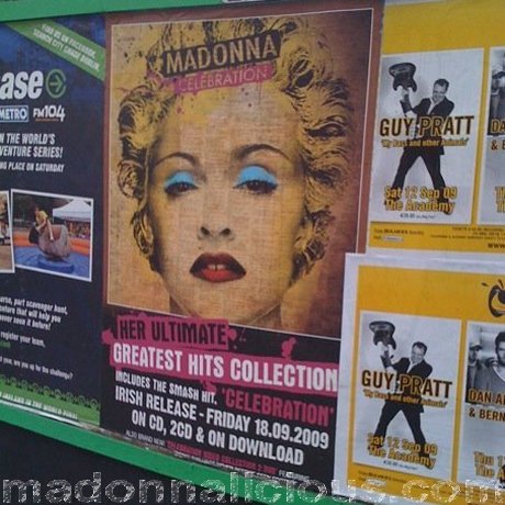
On this Madonna Ad they have made the cd cover the feature in the centre/top part of the print. They have then used contrasting colours to display the information underneath. This works well as it does not draw attention away from the cover. It also allows the audience to see a picture of the cover so that if they want to go out and buy it, they are familiar with it.

I love the simplicity of the mumford and sons ad! it uses the artist and album name as the main text on the album, displaying other relevant information in a smaller type face. Some of the other information includes songs that are featured, release date etc. I think a minimal look is definitely more striking, and looks professional. This all contributes to the reputation of the band so the image is really important. The photos are of each band member, however as jordan is a solo artist we do not need to worry about this.

I love the back of the mumford and sons album cover! it reminds me slightly of the one i created. I think the minimal look works best as it allows the consumer to find the track with ease. I like the way the song names are displayed although i think it is easier to navigate as a list.

this Florence and the machine ad creates a glamourous image for the band, however i do not think it is in keeping with the other band prints. I like the use of fonts, and although i do not read the language it is written in, the imformation is minimal and uses techniques to try and sell the album, e.g. "hit album" "brit awards 2010". Florence's album cover also features a similar layout to the one i have used, featuring the artist at the top, and album name below. I think this works well as it is neat, and simple to follow.

Light speed Champion's album also features the typography layout I am using for my Cover, it is very conventional, but looks neat and polished. the simplicity of this layout looks very professional, which is why i think it is a safe style to use.
No comments:
Post a Comment